FreeOnes Has a New Menu!
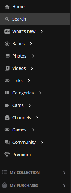
Yes! We have a new menu!
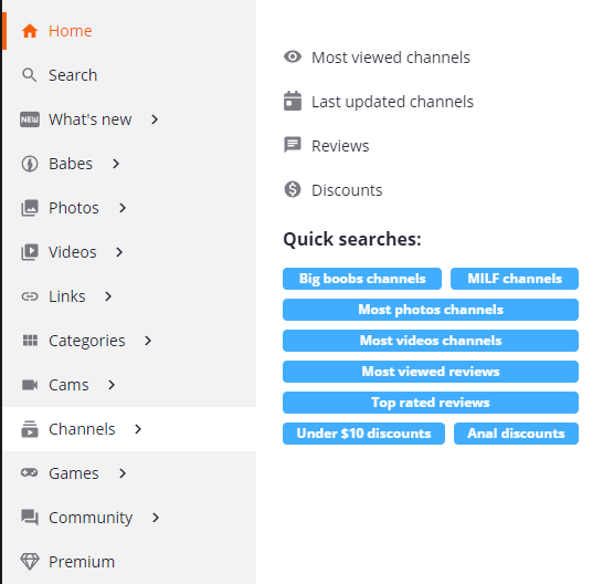
Have you noticed something different? Maybe that the site menu is a little shorter and when you hover your mouse over an item it expands out?
What Made Us Want to Update?
In this past year we have added several new sections to the site.
This honestly made the menu very long. Especially since we added the My Purchases section for logged in users at the very end!
Grouping similar features into a menu with a sub menu just made sense at this point!
How Do I Get the Sub Menu?
Simple, just hover your mouse over the menu items and you can see what kind of goodies are waiting for you?
Some sections will have links to things like most viewed channels or discounts under $10!
Where Can I Find Everything That Was a Menu Item Before?
Here is a list of the groupings:
- What’s New
- Upcoming
- News
- Babes
- Photos
- GIFs
- Videos
- Videos on Demand
- Links
- Categories
- Tags
- Cams
- Channels
- Reviews
- Discounts
- Games
- Community
- Forums
- Feedback
- Premium
What About Mobile?
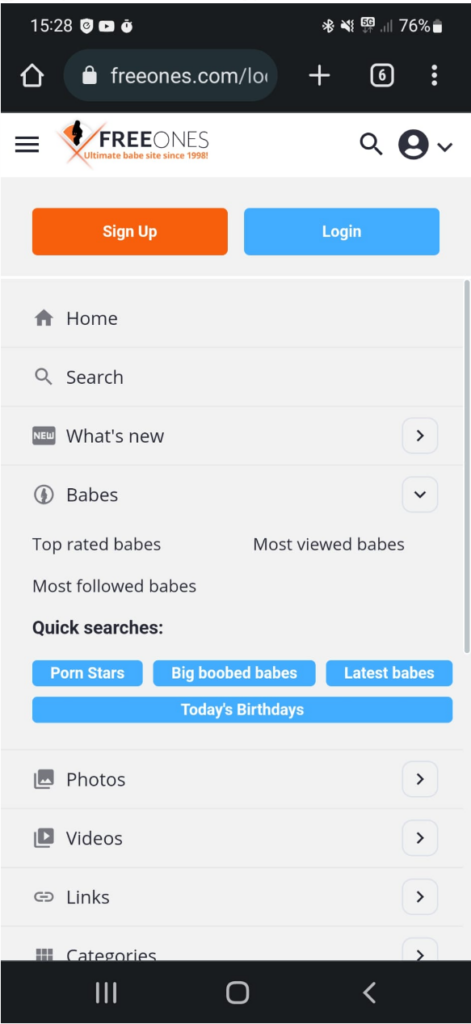
The new menu is also grouped on mobile. However, it will appear as a list as in the screen shot to the right. If you want to see the sub menu items, you’ll need to click on the carrot icon (that’s this icon > ). Then that menu item will expand!
To close the sub menu, just click on the carrot icon again. It’s that easy! This should save a lot of scrolling!
What if I Hate the New Menu?
I say it many times. Change is hard. We get it! You get used to the layout and format of a site and then it changes on you.
We really hope that the new menu is a good change and that you like it. However, if you feel strongly about it, you can always make a post in the feedback section to let us know!
Of course, if you have ideas on how to make the menu even better, feel free to add a request! The more upvotes, the more likely we’re going to take a serious look at it!

